This says it all.

Luke Smitherd.com
Book. Blog. Bullsh...er Baloney
The Stone Man: The Audiobook!
Hey guys. I’ve been working on a lot of things … expect regular stuff on here now. Trust me 😀
Stuff like this! One of those things I’ve been busy with is coming to fruition. I’m very excited to announce the upcoming audiobook of The Stone Man, read by the excellent Matt Addis and featuring an all-new afterword read by me … so how about a teaser sample? Check it out!
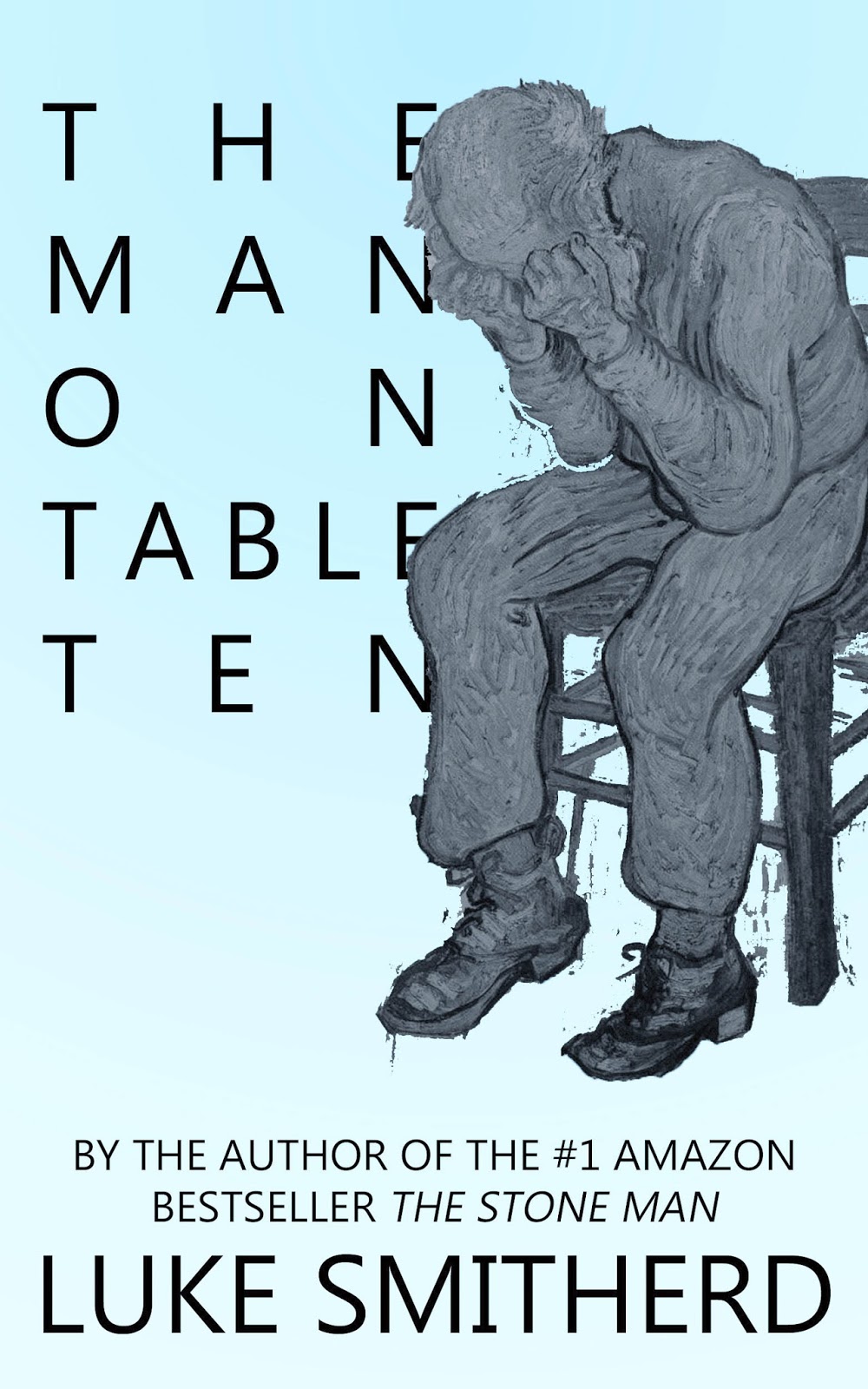
What’s the new book all about? OUT SUNDAY MAY 11TH!

Sorry it’s been a bit quiet here on the website for a while … but it’s because I’ve been WRITING! And the new book is out THIS SUNDAY! It’s called A HEAD FULL OF KNIVES, and here’s the blurb:
Martin Hogan is being watched, all of the time. He just doesn’t know it yet.
It started a long time ago, too, even before his wife died. Before he started walking every day. Before the walks became an attempt to find a release from the whirlwind that his brain has turned into.
He never walks alone, of course, although his 18 month old son and his faithful dog, Scoffer, aren’t the greatest conversationalists.
Then the walks become longer. Then the other dog starts showing up. The big white one, with the funny looking head. The one that sits and watches Martin and his family as they walk away.
All over the world, the first attacks begin. The Brotherhood of the Raid make their existence known; a leaderless group who randomly and inexplicably assault both strangers and loved ones without explanation.
Martin and the surviving members of his family are about to find that these events are connected. Caught at the centre of the world as it changes beyond recognition, Martin will be faced with a series of impossible choices … but how can an ordinary and broken man figure out the unthinkable? What can he possibly do with a head full of knives?
Luke Smitherd (author of the Amazon bestseller THE STONE MAN and THE BLACK ROOM series) asks you once again to consider what you would do in his latest unusual and original novel. A HEAD FULL OF KNIVES will not only change the way you look at your pets forever, but will force you to decide the fate of the world when it lies in your hands.
Out Sunday May 11th!
NEW BOOK INFO! Interview over on sfsignal.com about The Stone Man, The Black Room … and the next book, ‘A Terrible Grip!’
Yep, it’s another interview, this time with the good people over at sfsignal.com, courtesy of Max Pfeffer. This one goes more in-depth on my thoughts regarding The Stone Man, and perhaps more interestingly for you long-time Smithereens, some titillation about the NEW book, hopefully available by April. Max asks some sharp questions here about the themes and ideas behind TSM, and it was nice to talk about them. Check it out:

Whaddya know? One Has Been Jolly Well Interviewed … AGAIN!
Hi folks, it seems several Smithereens (this is actually catching. I. Do. Not. Believe. It) on the Luke Smitherd Book Stuff Facebook Page are emailing about not hearing the interview that they missed with me on BBC Coventry and Warwickshire today (well, yesterday, as it’s nearly 2am here but I’m not in bed yet). In particular, my American readers who were only just waking up when it was on, especially as I didn’t mention anything about it online before it happened.
Well, fret no more, because here it is in it’s entirety. Don’t expect any searing insights into the creative process, or tips on self-publishing; it’s very light, very fluffy, and probably focuses more on the ‘tribute act’ element of my day (night) job than the books, but for those of you that may be wondering what I sound like, it’s all here. You also get to hear me do an American/Canadian accent that drops badly in and out as I begin to wonder what the hell I’m supposed to be saying. Either way, I’m very grateful to the good people of BBC Coventry and Warwickshire for having me on anf for giving me a chance to plug my stuff to their audience. I enjoyed doing it. See what you think:
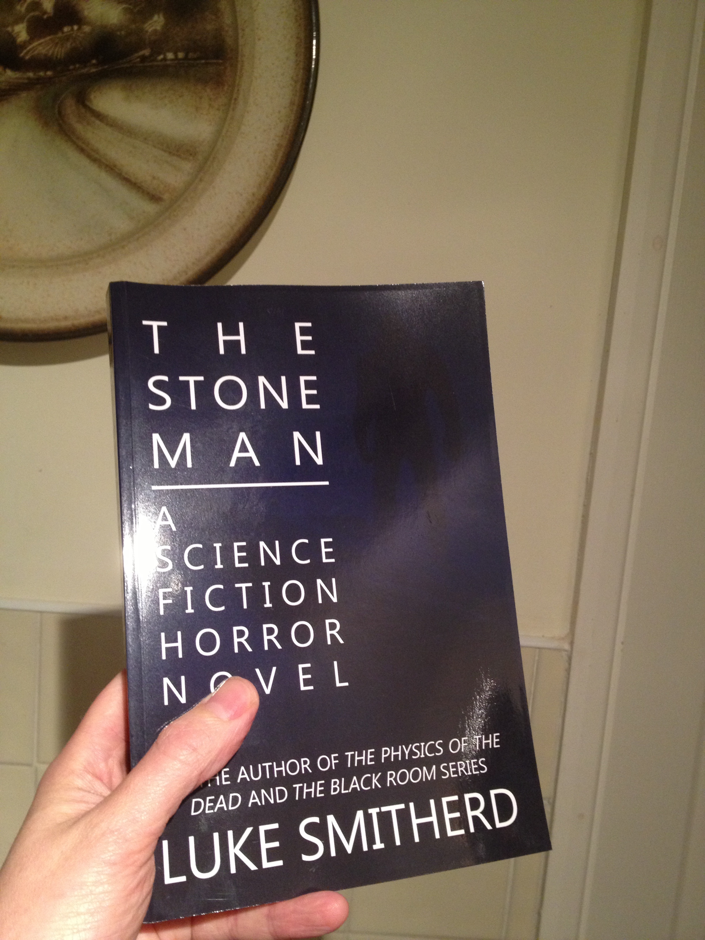
Paperback Paparazzi! Let’s See Your TSM Paperback Snaps!
Seeing as The Stone Man has been out in paperback (thanks to Amazon Createspace) for a few days now and has actually shifted a few copies, I thought it might be fun if those of you that have made very, VERY sensible choices and bought a copy sent me in a shot of the book; either just the book in an interesting location, yourself holding it, or even just a shot of it sitting snugly in your hand. I’d love to see them, and either way I’ll post all of the ones I get up on here! And BEFORE any wags send in their shots of them wiping their arses with it, I saw the gag coming, okay ..?
Hmm, anyway, maybe I’ll think up some sort of little prize for the best photo? I’ll ponder it …
Anyway, for now, here’s my very basic attempt. Surely you can do better than this, or at least match it? 🙂
AIN’T IT COOL NEWS.COM SUPPORTING THE CAUSE!
The Stone Man just got a very nice review from aintitcoolnews.com, and just in time for the paperback release. Click on the image below to read it; they say some lovely things about me. Very flattering, and pretty exciting too, as this is my first proper media review. Chuffed to bits! 🙂

‘THE STONE MAN’ – THE TRAILER! PLEASE SHARE!
Hi folks,
It’s been a while since I updated the blog, but I’ve been preparing to give the entire website an overhaul whilst working feverishly on book promotion, as well as preparing for the PAPERBACK LAUNCH of TSM on November 12th. As a part of that, here’s a link to the new trailer for The Stone Man; I’d be very interested to hear from people who have read the book, and get their opinion on whether or not this captures the tone of the book/sells it correctly.
Enjoy:
ONE HAS BEEN JOLLY WELL INTERVIEWED

“You have nothing interesting to say.”
Yep! I’ve been interviewed by my good friend, Roland Hulme – raconteur, bon-vivant, dashing social media genius and a cad in every way but the bad ones – for his excellent blog over at militantginger.com. It’s an always interesting look at a very English (in the good sense) Englishman’s perspective on all things American; I recommend it highly. And even more so today, as it features a whole lotta ME! But don’t let that put you off. If you’re interested in m’thoughts and all things self-publishing and the potential career that is hopefully involved therein (uh…that make sense?) then go check it out HERE.
COVER VERSIONS (THE NON-‘CUTE GIRL WITH A UKULELE’ KIND)
On a week when I’ve given all of the existing covers of my books an overhaul, I thought that I’d put up a piece about all of the recent changes involved with my covers, and of the importance of covers in general for the self-publisher.
“But Luke,” you may be saying, “hold it right there. If covers are so important, why did you do yours yourself?” Wellll, because it’s something I personally enjoy doing a lot, and take as much pride in creating as I do the contents. I love the idea of having a ‘uniform’ look to my covers, as well as the concept of having a different, bold single colour for each one combined with a central, minimalist figure/image; obviously, there’s no reason that I couldn’t tell a cover designer to make them that way, but I just really wanted to have a go myself. Perhaps unwise, but I felt strongly about it at the time.
Pictured: minimalism.
HOWEVER, I also appreciate that my covers so far have looked a touch home made; there has also been a major discrepancy in sales numbers for me between the US and UK Amazon sites. So why not try and make something that looks a little more ‘published’ – but still keeping the same single colour and uniform stylings as before – and see if it affects sales overseas? Especially on a week when I have my first reasonably expensive paid promotion coming up for any of my books (more on that another time.)
And if, after a few months, THAT doesn’t work, rhen I might have to look into busting the old coffers a bit more and digging up some money to pay a professional cover designer…and if I was going to do that, I’d give it to the excellent Paddy Green (@padgrn but more on HIM shortly.)
I’m currently reading ‘Self Printed’ by Catherine Ryan Howard (@cathryanhoward) and it’s been giving me a bit of a kick up the arse on a few issues book-wise, several of which should have been kind of obvious. I don’t agree with EVERYTHING she says (my readers rather seem to respond well to me my fairly sweary and ‘unprofessional’ self, both in my afterwords and online presence, and she advises being otherwise. She’s probably right in most cases, but it doesn’t seem to be the deal in mine…I think she’d probably despise the state of this blog too, but one step at a time and all that) but the her book has, so far, been very inspiring, and I recommend it highly to anyone considering self publishing. Anyway, she makes some good points regarding covers.
After all, your cover is your shop window. The Stone Man currently has 94 reviews on Amazon UK, which is great, but if the cover lets people know that my book is self published, a lot of people out there simply won’t touch a self-published book; why reduce your potential market? The perfect timing of discovering Catherine’s book and a tweet from the excellent Paddy Green (later, later) have spurred me into action.
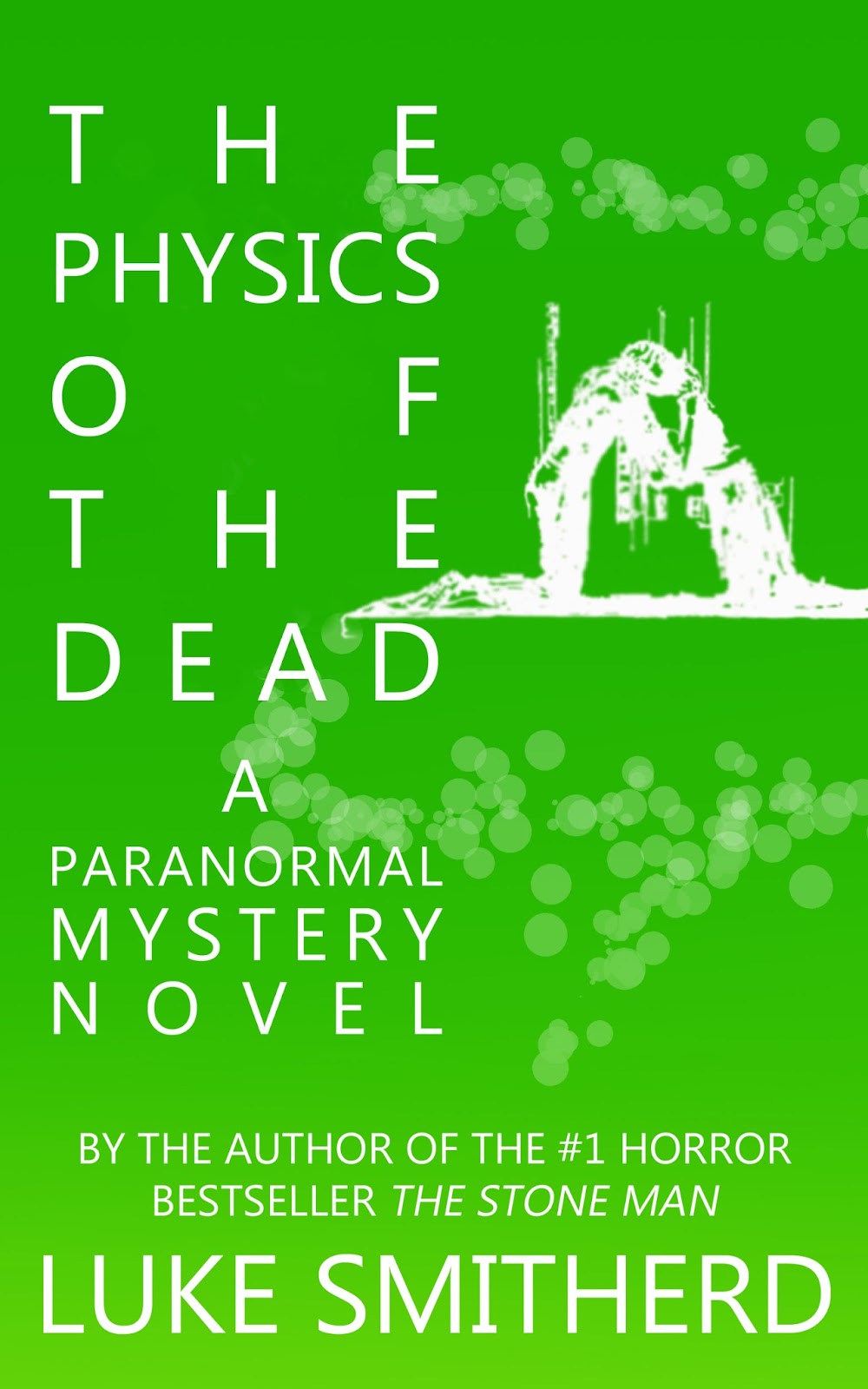
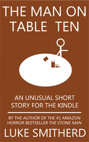
It may be more interesting to look at my own cover development through that of my first book, The Physics Of The Dead, as that is the only one of my books to have four different covers, three of which were all variations of themselves. Here’s the very first one, which I imagine the majority of you have never seen:

You may like it, you may hate it. Some did, some didn’t. Either way, it’s supposed to be in a very minimalist style, which always divides opinion. Or you might just think that it looks amateurish. Later, I changed it to this:

The idea, colour, and central image are all the same, but I prefer the font and the layout of the text. This is something I’d keep throughout all of my books for some time, and even when I overhauled everything, I kept the font and typesetting for my name. This styling then continued in the other covers:
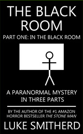
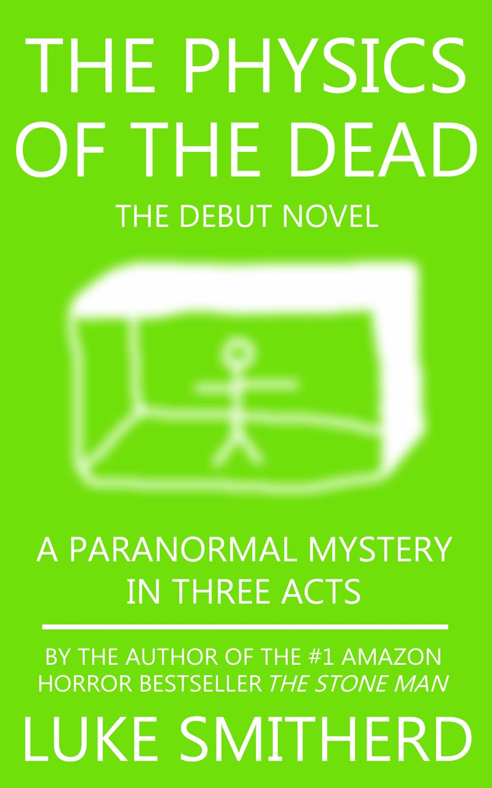
I realised that TPOTD didn’t quite fit in with this, plus the white text was hard to read against such a light green when thumbnail-sized on Amazon, so I changed it again:
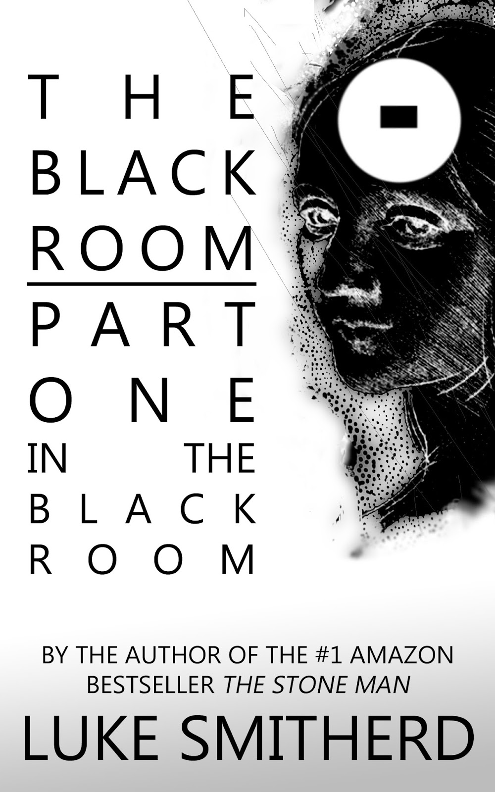
I have a lot of affection for these covers; but I recently realised that perhaps I’ve let that blinker me to the fact they do look home produced. So I’ve tried to do something a little more ‘published’ looking with their replacements (although, as with these, some people prefer them, some people despise them):

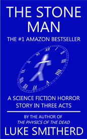
And, of course, The Physics Of The Dead (the only one that’s kept its original colour):

You can hopefully see the new uniform styling (text on the left, artwork on the right) and to me, it looks a lot more professional. You might disagree; I guess we’ll see if sales are affected in any way. However, there’s also another option…
You see, he excellent Paddy Green (see: earlier) got in touch via twitter to say that he enjoyed TPOTD, and that he’d discovered it as it followed a similar subject matter to his own book, The Old Terra Vitae. It was looking at Paddy’s cover (also self-published) and realising how much more professional it looked that my own, that combined with Catherine’s book to spur me into action; I half-jokingly asked if he fancied having a crack at re-doing TPOTD. Proving that the ‘Excellent’ in his name isn’t just a clever title, he promptly sent back two conceptual covers for it that even tie in some of the elements of the story (you’ll know if you’ve read it.) And here they are:


Both great, but I particularly like the second one. I would have used it too, if it wouldn’t mean redoing all of my other covers to tie them into a similar look. But what do you think? Do you hate them all, prefer the old ones, prefer the new ones, or even think that you could do better? Why not let me know in the comments section below? 🙂
You can find more of Catherine’s self-publishing thoughts on her blog, Catherine, Caffeinated and you can follow Paddy Green @padgrn.
To learn more about MY books (Woo!) visit www.lukesmitherd.com where you can buy them for the Kindle.